Every year starts in a rat race for the creative community. Lists of new web design trends hit our inboxes and we pivot to execute on the next big thing, but sometimes the renewed inspiration doesn’t work in our favor. The designers and developers that collaborate on their work also have to tag-team in their learning. Complications in new programming can arise and some work just doesn’t fit the “trendy” mold. Mutual understanding is crucial to make sure that the slick new sites we want to create can function smoothly while meeting business needs.
With the latest design fads hot on our heels, we asked some of our in-house experts (Art Director, Nathan Hurst, and Lead Interactive Developer, Matthew Roosa) to discuss their thoughts on what's coming and how it’s already affecting the way they work.
Mindful Web Design — Less is more
Gone are the days of densely populated pages that are clogged with content. Newer sites are simplified and clean with generous amounts of negative space. They draw the viewer in with visual surprises that play double duty by being pleasant to consume as well as simple to navigate. Content animation and subtle visual effects help in keeping the open space from looking too flat or dated. They also lend themselves well to the mobile-first world we’re living in, making quick scanning for information easy.
Savour Design is a great example of mindful web design – calm and airy, showcasing content with serene animation. Pocket Penguins uses a similar, clutter-free method to highlight products, but rather than keep their negative space white they spice things up with fun floods of vibrant color.
Savour
Pocket Penguins
The Art Director’s take: I always love a well-designed website filled with white space, but honestly find it to be one of the hardest things to create. The balance of maintaining simplicity while creating a narrative that keeps you scrolling can be very challenging. What I love about the Pocket Penguins site is that the negative space creates a feeling of calm with floods of color and imagery that floats across the screen.
The Developer’s take: Sites with plenty of white space can be a little tricky to edit, but the open design allows for easy transitions on the responsive side of things. Focusing only on relevant content also makes for an easier build, allowing the developer to imagine the best experience and to structure things in such a manner for any device. Savour is a perfect example of this, as all of its content on desktop is also represented beautifully on mobile while maintaining the simplicity of the structure.
Going easy on the eyes — Welcome to Dark Mode
What once felt like a novelty feature on Twitter quickly became a must-have across social media platforms, and has worked its way into almost all of our devices’ OS options. Dark mode was an answer to a massive accessibility need, allowing easy website viewing that significantly cuts down on eye strain. Now more than ever with our digitally-driven careers and increased screen time, we’re on the lookout for new methods of cutting down on bright blue light pollution, and dark mode is a great solution.
Check out how seamlessly the NYC Metropolitan Transit Authority utilizes dark mode for their evening subway map. Less functionality — but just as cool — Cowboy embraced the dark side for their site in a way that makes total sense for their cutting-edge brand.
MTA-Subway-Map
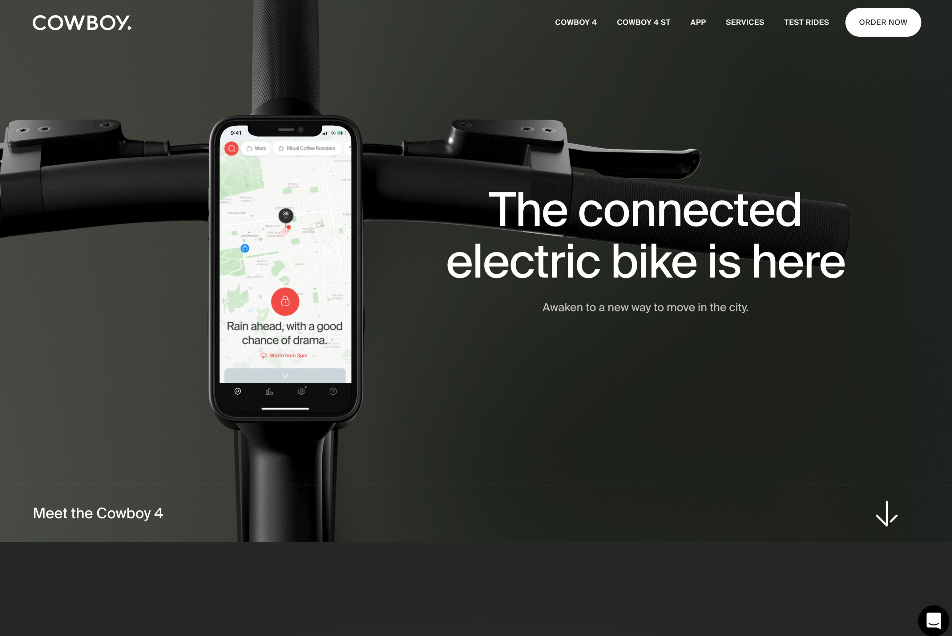
Cowboy
The Art Director’s take: I absolutely love Dark Mode but admit it’s not the first thing I think of when working on a web-based project. Most clients want to see their work light, bright, and airy. It becomes a tough sell to make a dark website or even a widget that turns it into dark mode. I think the problem could easily be solved by showcasing how dark mode can elevate the expected product shot floating in white space to something much more sleek, modern, and sophisticated – like Cowboy has done so well. I’d love to inject more of this into my own work, but I’d also note that it poses inherent challenges in adhering to Web Content Accessibility Guidelines (WCAG). This is crucial regarding legibility of a site and while some color schemes may be beautiful, they may just not pass.
The Developer’s take: Many sites can offer a dark mode option that only takes the quick switch of a stylesheet, so it’s a pretty easy ask from a developer’s standpoint. When it comes to sites that toggle between dark and light mode, I love the way the MTA website uses their settings as a way to inform the user of time of day while also being less intrusive in low-light situations.
Narrative Visualization — Show them a story
As we all know by now, attention spans are short and in order to engage viewers, content needs to be brief and easily digested. As a result, web designers have gotten craftier, transforming the user interface of websites into a story that creates a visual hook to guide the user. Referred to as Narrative Visualization or Scrollytelling, this type of design gives you arresting visual treats as you scroll through the page – from elegantly typeset columns to quirky inset images, to subtle animations, and more. Rather than a slog of information, the viewer gets taken through a full, blown-out story.
We love how Apple’s AirPodsPro site catches your eye, bringing you a new, dynamic visual element with every scroll. ESAB uses striking collages married with bold type and animated line art to visually entice the user to explore and learn more.
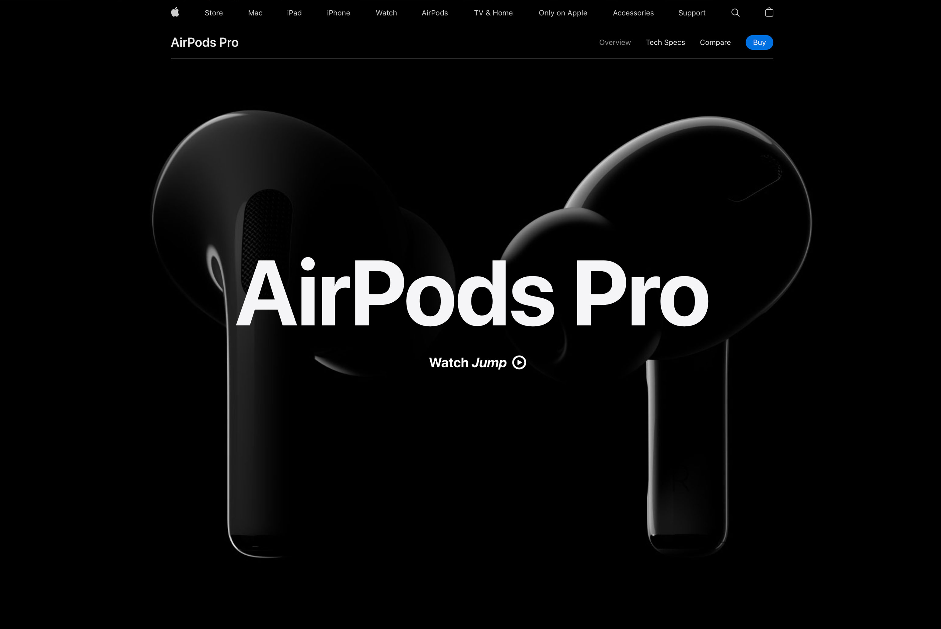
AirPods-Pro
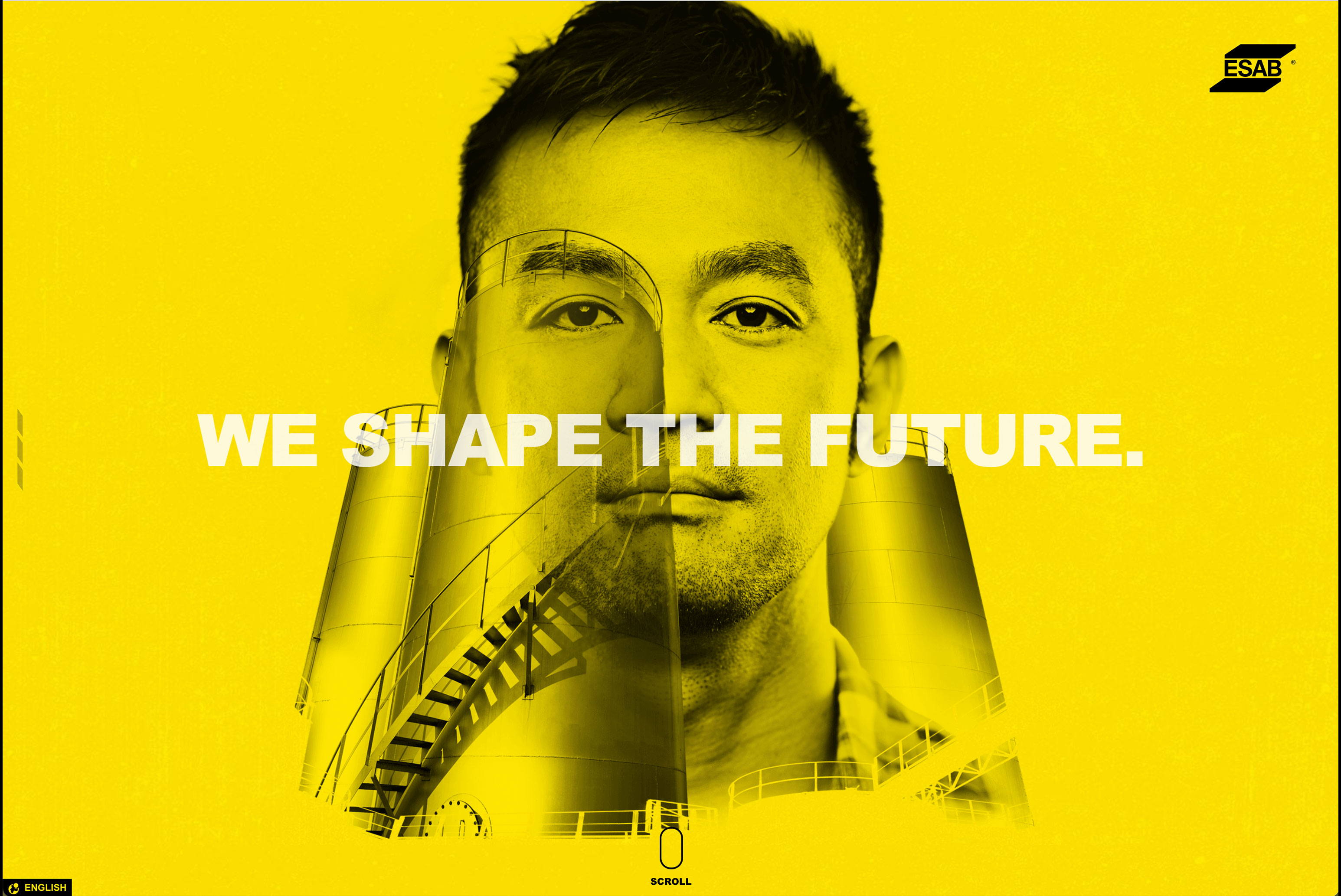
ESAB
The Art Director’s take: My approach to Narrative Visualization in web design is similar to how I storyboard for a video or animated banner. It becomes one of those things where the designer and developer have to work hand-in-hand each step of the way for the narrative to unfold in a way that’s successful. Communication around how and why this story builds and creates visualizations is key to delivering on the strategy behind the work. I think Narrative Visualization can be powerful like the AirPods example, but can easily fall flat if flashy design elements are used without purpose. It has to match the look and feel that is driving that brand.
The Developer’s take: Narrative visualization relies heavily on the latest web-friendly technologies to work without issue. The deceivingly clean and simple front-end experience is actually a complex series of technologies that take a lot of care and time to work together seamlessly. Some more involved interactive designs are challenging to make work across all devices due to the heavy reliance on web technology (javascript, in particular), and can make for a less-than-ideal experience on mobile.
Move over Stock Photography — Illustration is speaking
The number of Internet memes making fun of stock photos should tell you how stale they’ve gotten. Rather than recycle the same stiffly posed photography, brands are turning to alternate methods of visual storytelling. Custom illustrations can personify an idea and help establish a distinct tone of voice. From simple, organic shapes to entirely new worlds, adding elements of illustration can pack a powerful punch.
See how transportive illustration can be as you float through a whimsical landscape on Smashmallow’s site, or meet the playful, diverse characters of Langmobile that help you connect with your inner child’s sense of wonder.
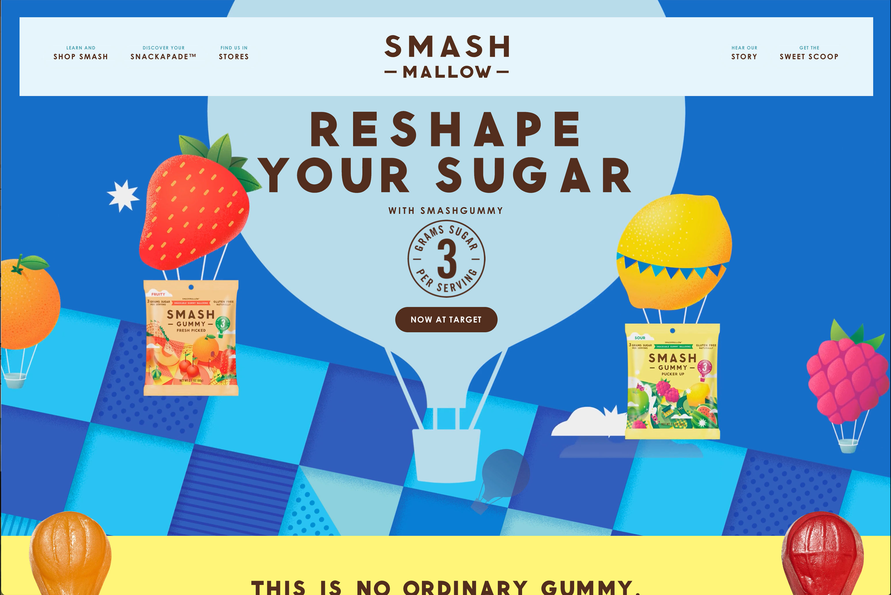
Smash Mallow
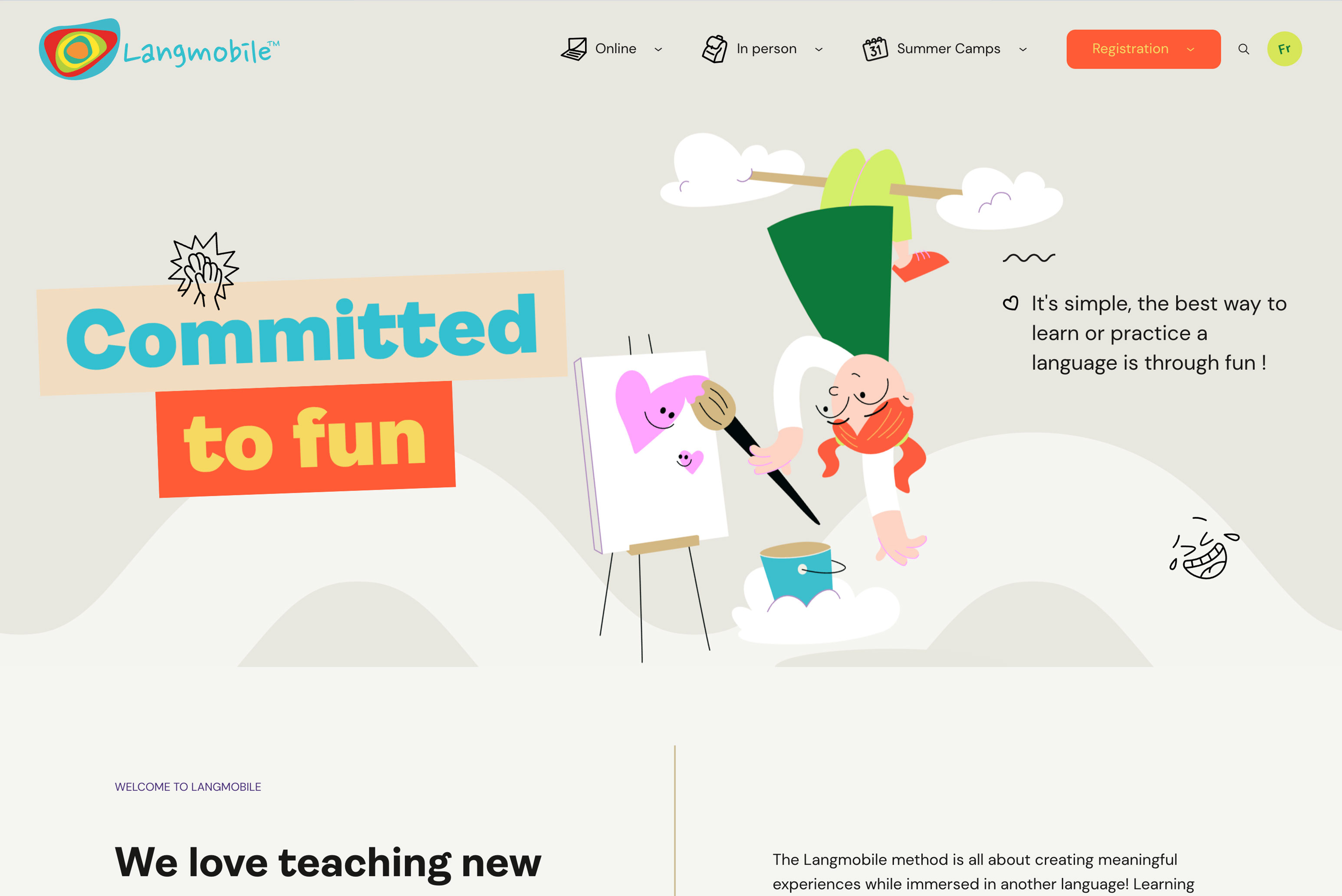
Langmobile
The Art Director’s take: I hate to play favorites but I love and sometimes even push too hard to use illustrations for my projects. There’s just something about how the addition of a graphic element can take a site from 0-100. My favorite part about Illustrations is no matter how flat they look, a programmer can breathe new life into them with subtle animations, or showcase them with a parallax scroll to give them depth. Everyone tends to turn to their stock budget to photography, but if you ask me, illustrations deserve their day in the sun.
The Developer’s take: Illustrations can pose challenges when it comes to displaying and integrating them with interactive content. Another thing to consider is file format, the most common being PNG and SVG. PNGs allow for high-quality images with alpha transparency, with the tradeoff being extra large file sizes and requiring the browser to resample the image as it’s resized. Additionally, load times get longer, and your site may not be mobile-friendly. SVGs are vector-based images that can scale up and down without the loss of quality and retain a small file size, but require less complex images and still have mixed usage support in different browsers. Neither format is perfect in all situations, and using a combination of them based on your content’s graphical needs is the best way to go.
Looking ahead
As we approach a new year of building bigger, better web-worlds, it’ll help to remember that accessibility is king. In turn, it’s influenced some modern, moody design trends that won’t be going away any time soon. You’ll also want to remember that trends are always subject to your own customization, and that good storytelling with a visual hook will never go out of style.